Web development
Website accessibility basics for UK businesses
An accessible website is easier for everyone to use. These are the practical basics every business site should cover, explained without jargon.
By Zafirox Tech Team · · 2 min read
Website accessibility means building a site that people can use whatever their abilities or circumstances. That includes people who are blind or have low vision, people who cannot use a mouse, people with hearing loss, people with dyslexia or other cognitive differences, and anyone using a phone in bright sunlight. Good accessibility tends to make a site better for everyone.
Why it matters to a business
There is a practical reason and a legal one. Practically, an inaccessible site turns away customers. Legally, UK organisations that provide goods and services have duties under the Equality Act 2010 to make reasonable adjustments, and public sector websites have specific requirements. This article is general information, not legal advice, so take advice if you are unsure about your obligations.
The standard to aim for
The most widely used benchmark is the Web Content Accessibility Guidelines (WCAG), published by the W3C. Most organisations aim for WCAG 2.2 level AA. Reaching it is a goal to work towards and test against. It is not something a plugin can grant you overnight.
Basics every site should cover
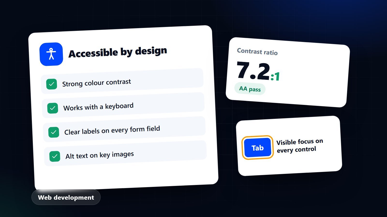
- Enough colour contrast. Text needs to stand out clearly from its background. Pale grey text on white looks stylish and is hard to read. Use a contrast checker on your brand colours.
- Keyboard access. Try using your site with only the Tab, Enter and arrow keys. You should be able to reach every link, menu and button, and always see where you are through a visible focus outline.
- Meaningful headings. Use one main heading per page and logical subheadings in order. Screen reader users often navigate by headings.
- Alt text for images. Describe what an informative image shows or why it is there. Purely decorative images should be marked so they are skipped.
- Clear link text. "Read our SEO guide" tells someone where they are going. "Click here" does not.
- Properly labelled forms. Every field needs a visible label, errors should say what went wrong and how to fix it, and required fields should be obvious.
- Readable text. Use a comfortable size, good line spacing and short paragraphs. The page should still work when text is enlarged.
- Captions and transcripts. Provide captions for videos and a transcript for audio.
- Respect motion preferences. Avoid autoplaying movement, and reduce animation for people who have asked their device to do so.
How to test your own website
- Run an automated checker such as Lighthouse or axe. These catch many common issues but typically not all of them.
- Navigate your key journeys by keyboard only.
- Zoom the page to 200 per cent and check nothing is cut off or overlapping.
- Try a screen reader on a key page, such as VoiceOver on Apple devices or NVDA on Windows.
- Ask real users with access needs to try it, where you can.
Build it in from the start
Fixing accessibility after launch costs more than designing for it. Clear layouts, sensible colour choices and well-structured code solve most issues before they appear. It also overlaps strongly with good UI and UX design and with the technical foundations in our launch checklist. If you would like us to review an existing site or build a new one with accessibility in mind, see our website design and development service or contact us.